Cookies help us display personalized product recommendations and ensure you have great shopping experience.

By using this site, you agree to the Privacy Policy and Terms of Use.
Accept
SmartData CollectiveSmartData Collective
  • Analytics
    AnalyticsShow More
    media monitoring
    Signals In The Noise: Using Media Monitoring To Manage Negative Publicity
    5 Min Read
    data analytics
    How Data Analytics Can Help You Construct A Financial Weather Map
    4 Min Read
    financial analytics
    Financial Analytics Shows The Hidden Cost Of Not Switching Systems
    4 Min Read
    warehouse accidents
    Data Analytics and the Future of Warehouse Safety
    10 Min Read
    stock investing and data analytics
    How Data Analytics Supports Smarter Stock Trading Strategies
    4 Min Read
  • Big Data
  • BI
  • Exclusive
  • IT
  • Marketing
  • Software
Search
© 2008-25 SmartData Collective. All Rights Reserved.
Reading: Data Comes Alive!
Share
Notification
Font ResizerAa
SmartData CollectiveSmartData Collective
Font ResizerAa
Search
  • About
  • Help
  • Privacy
Follow US
© 2008-23 SmartData Collective. All Rights Reserved.
SmartData Collective > Big Data > Data Visualization > Data Comes Alive!
CommentaryData Visualization

Data Comes Alive!

MIKE20
MIKE20
3 Min Read
SHARE

When most people think of data, images of complex Microsoft workbooks and spreadsheets come to mind. Tables with rows and columns of structured data like dates, stock prices, sales, home sales, and invoices.

Contents
  • Stories Over Spreadsheets
  • Simon Says
  • Feedback

When most people think of data, images of complex Microsoft workbooks and spreadsheets come to mind. Tables with rows and columns of structured data like dates, stock prices, sales, home sales, and invoices.

Historically, many analysts and execs alike have had to think about data in this rather pedestrian way. To some extent, BI projects started in the mid to late 1990s changed that, although many organizations never “got around” to them. Excel was the killer app for this type of thing: simple, relatively powerful, and good enough.

More Read

Location Intelligence and Mobile BI: Advancing the ‘where’ in mining and exploration
Survey Says Only 7% of European Companies Rate Big Data as Relevant [VIDEO]
Visualizing Data in 3D with Lego
Salesforce Struggles to Deliver on the Dream of Analytics
Wordtree for Visual Text Exploration

These days, however, data visualization tools like Tableau and others allow users at all levels within an organization to think of data in a fundamentally different way. To paraphrase from the classic Peter Frampton album, data is starting to come alive.

Stories Over Spreadsheets

Are we talking about the death of the spreadsheet? Of course not. I just don’t see that happening anytime soon. However, no longer is Excel with attendant charts and pivot tables the sole means by which to present data, particularly to decision makers.

In the words of Kris Hammond, CTO of Narrative Science, a joint research project at Northwestern University Schools of Engineering and Journalism, ”For some people, a spreadsheet is a great device. For most people, not so much so. The story. The paragraph. The report. The prediction. The advisory. Those are much more powerful objects in our world, and they’re what we’re used to.”

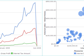
No argument here, but simple Excel charts can’t possibly do justice to certain types of data. Look at the following figure:

One could make the argument that this is the equivalent of data art.

Simon Says

Get out of the “data is boring” mind-set. It doesn’t have to be. SaaS-based and open-source tools allow even cash-strapped organizations to make data interactive, informative, and dare I say exciting. Forget new colors, fonts, or superficial treatments. More than ever, it’s easy to make your data tell a story, to learn new things from visualized data that would otherwise be lost in plain-Jane columns and rows.

Without question, data can be turned into information and, ultimately, knowledge. Old school employees and execs need to realize that decisions for the most part today should be made based upon solid data, but the presentation of that data need not be boring.

Feedback

What say you?

Share This Article
Facebook Pinterest LinkedIn
Share

Follow us on Facebook

Latest News

NO-CODE
Breaking down SPARC Emulation Technology: Zero Code Re-write
Exclusive News Software
online business using analytics
Why Some Businesses Seem to Win Online Without Ever Feeling Like They Are Trying
Exclusive News
edi compliance with AI
AI Is Transforming EDI Compliance Services
Exclusive News
companies using big data
5 Industries Driving Big Data Technology Growth
Big Data Exclusive

Stay Connected

1.2KFollowersLike
33.7KFollowersFollow
222FollowersPin

You Might also Like

top data visualization tools
Big DataData Visualization

5 Top Data Visualization Tools for Research Projects

9 Min Read

Social Data on Chinese Microblogs and the Oscars

3 Min Read

Solving Smith’s Dashboard Disdain: Reimagine BI communication with Collaborative BI

19 Min Read

We Need an “Internet of Not Only Customers”

15 Min Read

SmartData Collective is one of the largest & trusted community covering technical content about Big Data, BI, Cloud, Analytics, Artificial Intelligence, IoT & more.

ai in ecommerce
Artificial Intelligence for eCommerce: A Closer Look
Artificial Intelligence
ai is improving the safety of cars
From Bolts to Bots: How AI Is Fortifying the Automotive Industry
Artificial Intelligence

Quick Link

  • About
  • Contact
  • Privacy
Follow US
© 2008-25 SmartData Collective. All Rights Reserved.
Welcome Back!

Sign in to your account

Username or Email Address
Password

Lost your password?