A statistical method we often overlook is the distribution curve. I think most of the time it is dismissed because people get nervous about using statistics if they are comfortable with math. While there are some advanced concepts around using a frequency curve, it can also be used visually as a simple tool to explain results.
A simple stats lesson….
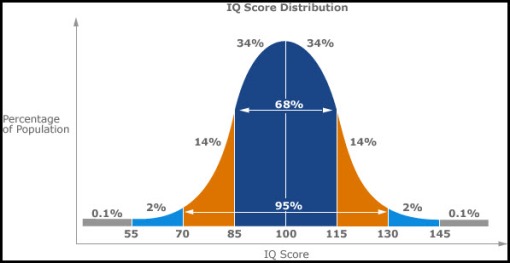
Normal Bell Curve – roughly 68% of the population is within 1 standard deviation (measure of variation) of the average and 95% is within two standard deviations. Below is an example of IQ scores. The average score is 100 and 68% of the data is between 85 & 115.
While this visualization doesn’t do a tremendous amount for us, this is what we assume when we think of populations, like customers and employees. And because of our limited statistical training we make a large number of assumptions based on averages. We love to look at average revenue: average revenue per employee, average revenue per customer, etc. This thinking also gets us looking into the outliers (that <5% that sits way out to the left or right of the chart). How much time do you spend on less than 5% of the business?
OK, so back to thinking of this in terms of running a business….
Let’s map out our revenue per customer. I would be willing to bet it looks something like the following:
If this is the customer revenue distribution, if we use the average number in our analyzes we can quickly generate a number of wrong assumptions. First and foremost, our typical customer is larger than reality. It might lead us to think we are serving mid-sized businesses than more likely smaller market customers. I am also willing to bet our profitability per customer has a similar curve to it. In this case we are likely spending money on the wrong customers and aligning our better services to a lower profit generating customer (or more likely a profit destroying customer).
Do we need to use it in everything? Of course not, but it might help everyone once in a while to challenge our overuse of the mathematical average to reassess perspectives of our business. A great place to start is map out the customer base in terms of revenue (profitability is better, but takes a lot longer to do). It might just lead you to understand your customer (think customer segmentation) better.
Real life example…I was once part of a research project to understand discounting to one side of the outliers (<1% of the business). The outcome was to focus on reducing discounting to that <1% of the business. What I argued was to focus on the larger part of the business, where the same efforts would have resulted in millions more in terms of profits. It was a clear lesson is where to apply process improvement.
