Cloud design tools are creating a new future for the design profession. One study found that 47% of companies that use CAD software are implementing or strongly considering implementing a cloud-based CAD solution in the future. The number of professionals using other cloud-based design applications is even higher.
We talked about the use of machine learning and big data in web development. However, there are other machine learning algorithms that can be used for design platforms.
There are tons of applications for UI/UX design out there for both experienced professional designers and people that are new to the field. Unfortunately, most of the better design platforms aren’t built for enhanced collaboration, which is a very important feature for large design and development teams where multiple people may need to work on a single design. The answer to that is a cloud-based service like Figma, MockFlow, or Wondershare Mockitt.

The last of these is especially intriguing because it has several advantages over the other platforms. One such example is the ability to create dynamic widgets that can show multiple states within a single artboard. There are more such unique features, which we will try and uncover in this review.
The User Interface
Machine learning has changed the nature of online platforms. This is especially true with applications that run over the cloud. However, in addition to having a good machine learning algorithm in place, it is also important to have an interface that is intuitive from a GUI standpoint.
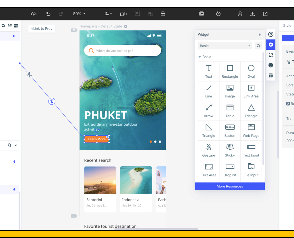
The best tools have a very clean and minimalistic interface, but you can feel the power pulsing under the hood. The design is uncluttered and the use of space is quite clever. Once you create a new project, most of these platforms show a central workspace where you add your screens/artboards and various page states. To the left, there is usually a navigation panel and a quick access panel for frequently-used components. To the right is your main asset library and other tools, as well as the Properties panel where you can edit the attributes of the components you add to your screens. The top is a high-level menu that takes you to the Preview and Handoff modes, and it also has options to download or share designs.
Usage and Features
Most cloud-based UI design tools have given great thought to usability, which is ideal for new designers who are just finding their feet. They are widely used for logo design. The drag-and-drop feature for components and widgets is complemented by double-click and drawing options. The widget can then be edited on the panel to the right of the main canvas. The library is fairly extensive but you can also customize the assets and create a personal or shared library for reuse in other projects. Assets can also be assigned a “Master” status that behave like Main Components in Adobe XD; these allow the user to edit in one place and have the changes applied globally.
These tools also create interactive prototyping a breeze. All you need to do is drag a link from an asset to its target page, and then edit the link to add a gesture, transitions, and other animated effects. The design can be previewed at any time to make sure that the various parts of your prototype work as intended. Once you’re ready, you can easily share a link for others to view your prototype; you can also download it for offline viewing as a full HTML demo package, and Android APK file, or as a PNG image file. In addition, since the software is hosted online, it’s very easy for others to directly comment and your designs and provide quick feedback.
One of the stand-out features of these tools is the ability to do a seamless handoff to the developer. This is an area where a lot of design tools fail miserably for one reason or another. In some cases, no code is generated or the output cannot be taken in HTML format, as with Adobe XD. In other cases, every little change to the design means re-generating the entire code. With the right design platform, every asset that is used or modified automatically has its back-end code and style code modified, which means the developer can confidently download all required information at the end of the design phase without having to worry about whether the code is the most recent and current one. They can also inspect code by logging into your account and viewing designs shared with them. It is the best choice for making an app.
High-level Benefits
The collaboration part is probably the biggest benefit of using a cloud-based UI platform for your design and prototyping needs. The real-time environment allows other stakeholders to have a perpetual view of your design in progress so they can provide rapid feedback for subsequent iterations. This eliminates the need for formal design review meetings, which can take up a lot of valuable time.
Another major benefit of the collaborative environment is the ability for multiple designers to co-edit projects on the fly. The most recent changes show up immediately, which avoids overlap and other issues.
From a designer’s viewpoint, the tool is extremely user-friendly, and fully functional prototypes of basic applications and websites can be put together in a very short amount of time. The auto-generation of back-end code means the designer doesn’t need to know HTML or even the basics of coding. The documentation and code for every asset used is automatically generated and saved to the project, which is directly accessible to the developer, making the handoff process as smooth as possible.
Also, if you’re switching from a platform like Sketch for Mac, you can use the Sketch plugin to import your designs and quickly prototype them.
Finally, from an affordability perspective, many developers are in the middle of the pricing spectrum, which makes it ideal for freelance designers and smaller design teams as well as large teams spread across multiple geographies.
How to Use These Platforms
A description of the hands-on experience with these types of tools reveal their versatile nature. This is what you can expect when you first start using this cloud software.
- After creating an account and logging in, you’ll be taken to the main dashboard. This is where you can view existing projects and create new ones. Creating a new project will take you to a page where you can name the project and choose the target device type for the design.
- The main design page, as mentioned in the overview section above, is where the action is. This is where you can drag and drop widgets, create links, add gestures and effects, create page states, create dynamic widgets, and so on. You can also leave sticky notes as annotations so others can follow your design’s logic flow.
- Once the prototype is ready, it can be downloaded for offline viewing, shared with others as an only preview, or directly sent to the developer for the next stage in product development.
Since all your work is saved in the cloud and everything is accessed through the browser, you can work from virtually anywhere – home, office, and even on the go. This brings a lot of flexibility into the equation that you can’t expect from an installable software. In simple words, many of these cloud-based design platforms combine the best features of desktop software with the powerful collaboration features of an online service, and all of this at an affordable price point. The only drawback, if any, would be a lack of third-party integration apart from the Sketch plugin. We hope those will come soon.
Big Data is Changing the Nature of Design
Big data is becoming more important to the field of graphic design than ever. Many of these systems can be organized over the cloud. The benefits listed above should be helpful.


