Yesterday the Mass Layoff report was issued by the United States Department of Labor – Bureau of Labor Statistics. The data here is interesting in a few ways. The Mass Layoff report highlights the number of events where 50 or people were laid off by the same firm.
- Perhaps a little good news for the US economy
- A little analytics lesson
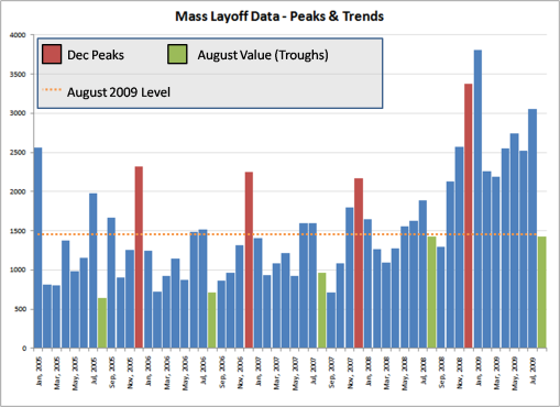
First off, the US Economy. We can look at a couple of things here that probably tell us the situation is still bad, but perhaps another indicator that we are rebounding. In the first chart, the bars represent the events (not total layoffs – but the numbers are highly related). You can see that the number for August appears to be quite a bit better than July and the previous 12 months, but August is also lower in general. When you consider the raw volume of the last 12 months, perhaps we just ran out of people to layoff. My initial assessment is that while it looks like we are heading in the right direction, we may just be witnessing the normal August dip. Call it cautious optimism.
Now looking at the data from a visual standpoint… below is how we typically look at this type of data. Here we would conclude that things look like we have hit …
Yesterday the Mass Layoff report was issued by the United States Department of Labor – Bureau of Labor Statistics. The data here is interesting in a few ways. The Mass Layoff report highlights the number of events where 50 or people were laid off by the same firm.
- Perhaps a little good news for the US economy
- A little analytics lesson
First off, the US Economy. We can look at a couple of things here that probably tell us the situation is still bad, but perhaps another indicator that we are rebounding. In the first chart, the bars represent the events (not total layoffs – but the numbers are highly related). You can see that the number for August appears to be quite a bit better than July and the previous 12 months, but August is also lower in general. When you consider the raw volume of the last 12 months, perhaps we just ran out of people to layoff. My initial assessment is that while it looks like we are heading in the right direction, we may just be witnessing the normal August dip. Call it cautious optimism.
Now looking at the data from a visual standpoint… below is how we typically look at this type of data. Here we would conclude that things look like we have hit bottom and are moving in the right direction.
Yet if we look a little more closely at the data above (and perhaps dig at some of the underlying regional or industry data), we can make a lot of different potential comments.
- We are coming out of a major event – any data is going to be a little blurry. Any investments are going to be risky, but with that risk comes the upside reward of potentially being a first mover.
- The general trend might be improving, but the volumes are still way above normal levels. How long can we continue to shed people like we have for the last 12 months?
- The peaks and troughs also show that we are still greater than 2x normal levels. Clearly, there are still problems in the economy.
Posted in Environmental Scan, KPI, Performance Management, Visualization Tagged: Baumohl Series, KPI, Mass Layoffs, US Economic Indicator


