I sometimes sit in a café called “La Terrace” near my home in Paris. It’s next to the Metro stop Ecole Militaire, which is one of the closest stops to the Eiffel Tower.
So each time I have my coffee and croissant, some of the 7 million or so visitors to the tower each year come out of the metro and consult this map of the 7th Arrondissement to try to help them figure out which way to go.

Here’s a close up – the Eiffel Tower is at the top left of the map below:

Let’s do a simple test of your information-processing skills. You’re a tourist, and you want to visit the Eiffel Tower. Should you turn left or right? …
I sometimes sit in a café called “La Terrace” near my home in Paris. It’s next to the Metro stop Ecole Militaire, which is one of the closest stops to the Eiffel Tower.
So each time I have my coffee and croissant, some of the 7 million or so visitors to the tower each year come out of the metro and consult this map of the 7th Arrondissement to try to help them figure out which way to go.

Here’s a close up – the Eiffel Tower is at the top left of the map below:

Let’s do a simple test of your information-processing skills. You’re a tourist, and you want to visit the Eiffel Tower. Should you turn left or right?
I’ll give you the answer, and some commentary about the implications of this on corporate decision-making, after the break: a bunch of photos of tourists doing the real-live test (it took only ten minutes to take this series, on a slow day)
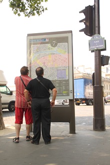
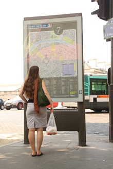

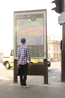
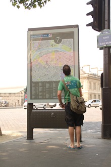
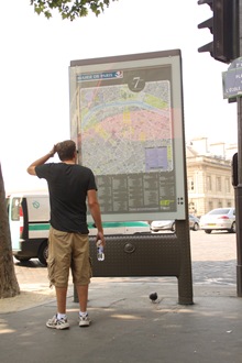
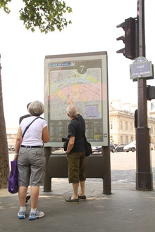
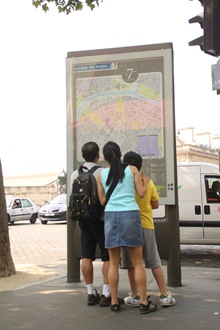

The answer is: you turn to your right (personally, I’d recommend walking through the Champs de Mars, via the green trees on the right-hand side of the top picture).
Because the map is “upside down” (you are facing south as you read it), this is deeply unintuitive for most people, and they spend several minutes puzzling over it, sometimes eventually wandering off in the wrong direction, only to reappear a few minutes later with sheepish looks on their faces.
So how does all this relate to real-life decision making?
Missing the big picture. You see a map, so you use the map to try to figure out where to go. But look at the top picture again, at the signs on the left-hand side. See the one that points explicitly to the Eiffel Tower? You already did? Congratulations! – almost none of the tourists do.
In business, too, one of the big issues with analyzing data is starting in the wrong place, and getting so concentrated on a particular type of analysis that you miss that other techniques might be more important. For example, a company might put a lot of emphasis on financial analysis, but forget to do any customer surveys.
For example, an enterprise software companies might try to to ascertain product “worth” by calculating revenue by product. But since the products are not sold independently, but are instead bundled into large deals with lots of other products, the calculations are (worse than) useless.
More concretely: if, say, Xcelsius is allocated $10,000 of revenue from a million-dollar deal, but I would have lost the deal to a competitor without it, the product is “worth” way more than $10K, and I should plan my future investments accordingly. In this case, the “softer” customer survey data of why they purchased would be more reliable and valuable.
More information needed. Your first reaction to the test may have been “I don’t have enough information.”
But the placement of the red dot is very clear. You can only be at the corner of avenue Bosquet and avenue de la Motte-Piquet, facing out into the center of the Place de L’Ecole Militaire. In theory, the average person with enough money to travel to Paris should be more than capable of visualizing themselves on the map and making the right choice within a few seconds.
But this is not what happens. The average tourist reaches up and puts their finger on the big red dot and spends at least a minute looking around wildly for some other guidance. I’m guessing this is because (a) it takes effort to rotate a map in your head (and they’re on vacation) and (b) they are looking for a second opinion.
This is true in business, too.
First, you shouldn’t make people work too hard to understand the data. For example, you should never show an audience slides that just show charts, with no conclusions.
Instead, prove to them that you didn’t just stick the data on the slide without even considering it (sadly, all too common, at least in marketing). Put the key points you think the data shows, next to the numbers, and then the audience can use their thinking time and effort to agree or disagree with you, and consider the implications, rather than pointlessly redoing your analysis.
And second, like the tourists, I want more than one data set. I’m much too cynical about data quality, so you should attempt to gather some other form of information (a survey, say) that comes to the same conclusion.
Limited collaboration. The tourists often talk among themselves about the decision (I saw one poor pre-teen kid that had to explain it to his parents five times in a row before they understood) – but they rarely actually ask somebody outside their group (such as anybody nearby not dressed as a tourist).
The same happens in business. The small team has been tasked with the analysis. They feel that it’s their job to go and get numbers from people, but they rarely discuss the decisions or data outside the small team, even if there are other non-executives that may actually have strong insights into the correct answer.
For example, a classic marketing analysis gaff is to do analysis and and start executing a plan without actually asking the sales people their opinion. They have their own biases, but they will often point out that some aspect of the plan is perfectly stupid.
Making it overly-complex. Just in case there are some super-geeks out there: yes, you can work out the right way to turn by assuming, correctly, that it’s morning (the coffee and croissant) and that the light is coming from the East, so West is to the map-reader’s right. But let’s face it, if you managed to spot all that, I suspect you’d read the map right in the first place.
Fixing the Problem
It drove me nuts watching all these people. So I bought a two-euro indelible marker pen designed for CDs from a store opposite and drew some arrows on the map: “you are facing this way”, “your left”, “your right”, and “behind you”.

The results:
(1) It didn’t seem to help much. You still have to “rotate the map in your head.” A few people clearly attempted to follow the advice (e.g., craning to look upside down), but even then some of them went the wrong way.
(2) So many people put their fat fingers on the sign while they were trying to figure it out it that the arrow wore off in less than a day.

Interestingly, I was in London a few weeks ago, and I’d noticed that they had spent considerable time and effort on exactly this problem.
At the Legible London site, they explain what they’ve done to make it easy for tourists to find their way around. They’ve added clear direction arrows on the edge of the signs to major destinations, and extra information like walking times and distances.
And, in particular, they use “Heads-up” mapping:
Rather than having north at the top, on-street signage maps are ‘heads-up’, which means they’re orientated to face the same way as the user is facing. This helps people understand their immediate environment more easily.
Here’s an example from the site:

How does this relate to corporate decision-making?
First, note that it takes extra effort to prepare the “heads-up” maps, because you have to know where they are going to be installed and which direction they are facing. But as we’ve seen, they’re more than worth the extra effort.
Business analysts must do the same – not only spend time on coming to conclusions from the data, but spending time and effort to make sure that the analysis is clear to others!
![]() Was this interesting? Share with others on Twitter with automatic URL shortening!
Was this interesting? Share with others on Twitter with automatic URL shortening!


