


Data-Driven Workers’ Compensation Claims Management
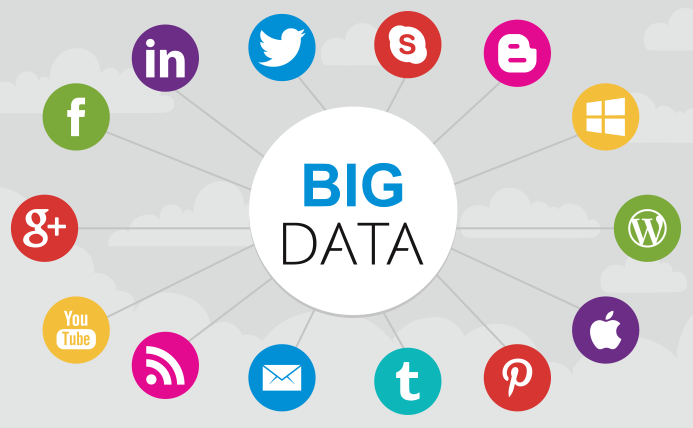
Introduction Did you know that 97.2% of businesses are using big data and AI? This number continues to grow. Almost every industry has used AI in recent years. "AI is…

The Role of Data Structures and Algorithms in Software Development
Data structures and algorithms serve as the building blocks of software development, providing developers with essential tools to organize and…

Financial Professionals Can Find Great Opportunities in Big Data Startups
We have talked a lot about some of the ways that big data is changing the financial sector. But what…

The Implications of Blockchain Technology on Big Data
Big data and blockchain technologies are both shaping the future of the tech industry in the United States and abroad.…

Why the Best Accident Lawyers Are Using AI
Did you know that the market for legal AI software was worth over $2 billion in 2022? It has grown even more in recent months. A growing number of lawyers…

AI Helps Telehealth Companies Manage Chronic Illnesses
AI technology has had a huge impact on the healthcare sector. Healthcare companies reportedly spent over $15.1 billion on AI…

The Future of Data-Driven Web Development: Trends and Technologies
Global businesses are expected to spend over $89 billion on web development in the next three years. Many factors are…

Revenue Models for AI-Powered Mobile Apps
Mobile artificial intelligence is becoming more popular every day. In 2022, the market for AI in mobile development was worth…