We use cookies, including third-party cookies from Google to serve personalized ads through AdSense, to operate this site and understand how it is used. By continuing to browse, you accept this use. See our Privacy Policy and Terms of Use for details, including how to opt out of personalized advertising.
Accept
SmartData CollectiveSmartData Collective
  • Analytics
    AnalyticsShow More
    What Kind of Problem-Solving Distinguishes Data Analysts From Software Engineers -- AI-generated illustration
    What Kind of Problem-Solving Distinguishes Data Analysts From Software Engineers
    7 Min Read
    chatgpt image jul 21, 2026, 04 34 30 pm
    4 Core Benefits of Predictive Maintenance after Vibration Analysis
    10 Min Read
    How Does Data Mining Boost Customer Satisfaction in Logistics? Harnessing Analytics for Results -- AI-generated illustration
    How Does Data Mining Boost Customer Satisfaction in Logistics? Harnessing Analytics for Results
    11 Min Read
    chatgpt image jul 13, 2026, 04 23 45 pm
    How Data Analytics Helps Companies Improve User Engagement
    19 Min Read
    chatgpt image jul 13, 2026, 03 59 46 pm
    How Data Analytics Improves Multi-Location Search Strategies
    10 Min Read
  • Big Data
  • BI
  • Exclusive
  • IT
  • Marketing
  • Software
Search
© 2008-25 SmartData Collective. All Rights Reserved.
Reading: Visualizing Data Correlation Using an XY Chart
Share
Notification
Font ResizerAa
SmartData CollectiveSmartData Collective
Font ResizerAa
Search
  • About
  • Help
  • Privacy
Follow US
© 2008-23 SmartData Collective. All Rights Reserved.
SmartData Collective > Statistics > Visualizing Data Correlation Using an XY Chart
Statistics

Visualizing Data Correlation Using an XY Chart

exploreanalytics
exploreanalytics
2 Min Read
Visualizing Data Correlation Using an XY Chart
Illustrative image generated with OpenAI gpt-image-1.
SHARE

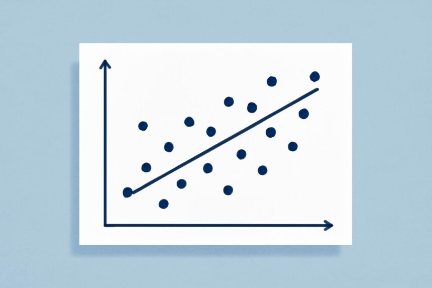
The XY chart is great for visualizing relationships between numerical data and finding correlations. Data can be presented as a scatter plot or a bubble chart. Let’s start with a scatter plot using an example.

Our example is based on a table of crime rates in US cities of 100,000 people or more. In this scatter plot, we have a point for every city in California in 2011. We also drew a linear trend line to visualize the possible correlation. As you can see, there is some correlation between the two types of crimes. Cities with a higher robbery rate tend to also have a higher murder rate. Nevertheless, the correlation is not very strong with some points far from the trend line indicating cities where one rate fails to predict the other rate.

The next XY chart is a bubble chart. In a bubble chart we show a third numerical value, in this case population. We represent this third value by varying the size of each point which we now call a bubble. We make the area of the bubble proportional to the value and therefore larger bubbles represent cities with larger populations.

The chart also demonstrates the capability to examine outliers. In our chart, we see one bubble with an exceptionally high murder rate. When we hover the mouse over it (or touch it on a touch device) we see more detail. In our example we see that the city is New Orleans.

More Read

Your Statistical Result is Below .05: Now What?
Why I’m Teaching Twitch to Predict the Future
Earthquake Prediction Through Sunspots Part II: common Data Mining Mistakes!
Using TIBCO Spotfire to Analyze Google Analytics Data
Big Data in the Sports Industry

We show you how to create an XY Chart and show you more capabilities in the following video:

Share This Article
Facebook Pinterest LinkedIn
Share

Follow us on Facebook

Latest News

Technical architecture diagram and decision framework for the trouble with ai that won’t leave a job unfinished
The Trouble With AI That Won’t Leave a Job Unfinished
Artificial Intelligence News
Technical architecture diagram and decision framework for ai-powered logo generation: design.com vs looka
AI-Powered Logo Generation: Design.com vs Looka
Artificial Intelligence Exclusive
Retailers Should Stop Treating Every Stockout as Equal -- AI-generated illustration
Retailers Should Stop Treating Every Stockout as Equal
Business Intelligence Exclusive
Best Vibe Coding Cleanup Specialists in the USA: Fix or Rebuild? -- AI-generated illustration
Best Vibe Coding Cleanup Specialists in the USA: Fix or Rebuild?
Development Exclusive

Stay Connected

1.2KFollowersLike
33.7KFollowersFollow
222FollowersPin

You Might also Like

Don't Gloat Over Excel Model Failures
AnalyticsCommentaryCulture/LeadershipNewsStatistics

Don’t Gloat Over Excel Model Failures

6 Min Read
'Moneyball' Takes the Next Big Leap
AnalyticsCommentaryExclusiveStatistics

‘Moneyball’ Takes the Next Big Leap

5 Min Read
Musings on Watson: Why Healthcare?
AnalyticsBusiness IntelligenceBusiness RulesCommentaryData MiningDecision ManagementKnowledge ManagementModelingNew ProductsNewsPredictive AnalyticsStatisticsText AnalyticsUnstructured Data

Musings on Watson: Why Healthcare?

12 Min Read
Moneyball & the Analytics of a Red Sox Playoff Panic
AnalyticsStatistics

Moneyball & the Analytics of a Red Sox Playoff Panic

6 Min Read

SmartData Collective is one of the largest & trusted community covering technical content about Big Data, BI, Cloud, Analytics, Artificial Intelligence, IoT & more.

From Bolts to Bots: How AI Is Fortifying the Automotive Industry
Artificial Intelligence
AI chatbots
AI Chatbots Can Help Retailers Convert Live Broadcast Viewers into Sales!
Chatbots

Quick Link

  • About
  • Contact
  • Privacy
Follow US
© 2008-26 SmartData Collective. All Rights Reserved.
Welcome Back!

Sign in to your account

Username or Email Address
Password

Lost your password?